How to Use the Layout Control
Preparation
Use a Panel control to contain the Layout control. This makes it easier to apply themes to all the objects in your panel. Note that there are no Themes for the Frame property.
To Add Your Controls
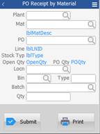
- Create your application form. For example, make your form 240 pixels wide and 320 pixels high. If you like having extra space for moving objects around before adding them, consider making the size larger then resetting it to your final size when done.
- Drag the Panel onto the form, and make it the same width as your form but ¾ of the Form’s height. Set your Panel’s anchor (Top, Left) and location (i.e. 10, 10). Note: The purpose of the panel is that it allows all child objects such as the Layout control and its objects to inherit common property values from the Panel’s Theme. You can add the Panel now, or add it after you’ve created your Layout control, then drag the Layout control onto the Panel.
- Drag your Layout control onto the Panel.
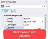
- Click on the ellipsis (...) in the Columns property. The Manage Columns Collection screen displays.
- Click on the
 add icon in the menu bar.
Repeat this step to add the required columns needed. - Set the SizeMode to Percent. For this example, add 5 columns and 12 rows, set the SizeMode to Percent, leave Visible to True, and ignore the Width.
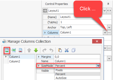
TIP: We added an extra column and row because it’s a good practice to have extras in case you need it. Its easier to delete a column and row rather than add it after everything else is set up.
To Add Your Rows - Create your rows using the same method described above, but use the Rows property.
- Set the height of your Layout (grid) control
- You now have a squishy grid. Calculate your desired overall grid height by multiplying the estimated row height by the number or rows. For example, our app requires 11 rows. (The 12th is an extra row.) We want each row to be about 22 pixels high. Therefore: 11 x 22 = 222 pixels. We entered 223.
- Set the Layout (grid) Size Height to 222 pixels.
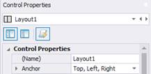
- Anchor the Panel and Layout to use Left, Top and Right.
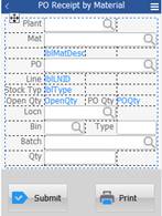
- Decide if any columns need to server as “spacers”. Drag all the prompts into their cells.
- Set your Layout Column properties.
- Since the first column has Labels, set the Column SizeType to AutoSize on columns that contain Labels and captions.
For example:
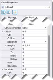
lblPlant > Alignment = Top, RightlblPlant > Layout > DockStyle = Fill
lblPlant > Layout > Margins: Right = 3
- To make your TextBoxes span across columns, select the TextBox and set the ColSpan value to the number of columns you want it to span. If you have TextBoxes that will all span the same number of columns you can use Control + Click to select them and then set their values. Remember to set the prompt’s DockStyle to Fill.
- Finalize Your Layouts.
- Stretch the Layout control to the size of the Panel and make sure both the Panel and Layout controls are anchored to Top, Left, and Right.
- Finish positioning the Layout with its location and anchoring if this has not been done already.
TIP: Anchoring the Layout control to the Bottom will cause it to grow taller if the form changes. If you want it to remain a static height, do not anchor to the Bottom.
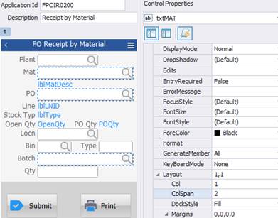
For example:
txtMat > Layout > ColSpan = 2
txtMat > Layout > DockStyle = Fill
txtMat > Layout > Margins = 3
If needed, align your labels so they won’t overlap your TextBoxes by changing the label’s Alignment properties.
TIP: If you have any columns that are empty, set the Layout control Column’s SizeType to Percent; if its empty and is set to AutoSize, it will collapse (1 pixel wide). This way, RFgen will automatically allocate remaining space to the empty column and make it easier to add any other prompts to that space.