The ImageList Control
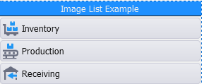
This object is a control used to display a list of options in an icon list format. The image size dictates the size of the row’s height. The text is also scalable. Horizontal and / or vertical scrollbars can be added but the control supports swiping up and down or left to right. If a title row is not required, it can be turned off.
The ImageList and ButtonList control are similar in that both will display the text and image inside the container. The ButtonList control allows you to display the tiles as separate buttons where as in the imagelist, the format is generally in rows. The difference between the ImageList/ButtonList and IconList is that the IconList displays the text outside of the icon's container.
Images (icons) are added using scripts (i.e. List.AddItem).
The TextOptions property group - sets the values for the FontSize and FontStyle. The sizing of the icon names (captions) and icons in a button/tile are affected by the margin, ScalePoint, and ScaleText. The Margin is the distance between text and the edge of the icon container. ScalePoints reduces the size of the text by the factor supplied. For example ScalePoint 0 or 1 sets the text default size; 2 makes the text 2 times smaller then the icon size. ScaleText, if set to True enables scaling of text; False prevents it from being scaled (reduced).
For property descriptions, see Graphical Control Properties.