Themes: Searches
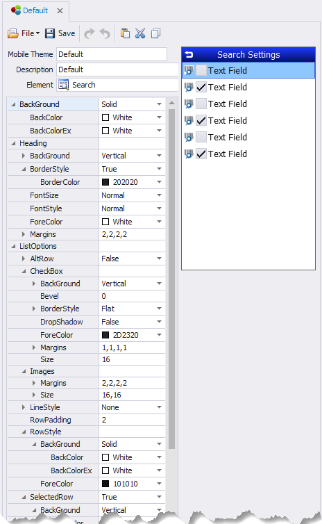
This sets the default styles for search screens reached from the form.
BackColor – the primary background color in a control.
BackColorAlt – the secondary background color in a control.
BackStyle – sets background colors as blended/solid if BackColor and BackColorAlt are used.
FontSize, FontStyle, and ForeColor are applied the same as in other examples.
Heading – sets the theme for Searches.
Align - Aligns the form header according to the selected setting (i.e. Top, Left; Top, Center etc.)
BackColor, BackColorAlt, BackStyle, Bevel, BorderColor, BorderStyle, FontSize, FontStyle and ForeColor are applied the same as in other examples.
Height – sets the heading’s height in pixels.
LineColor – the color of the lines within the grid if they are shown.
ListStyle – will hide or show the lines between rows and columns. None hides all the lines; Horizontal displays the lines between rows; Vertical displays the lines between columns; and Both displays lines between rows and columns.
RowSelector – sets the coloring and styling of a selected row.
BackColor, BackColorAlt, BackStyle, Bevel, ForeColor and Transparency are applied the same as in other examples.
RowStyles – sets the style for rows that alternate their colors.
AltRow - True will enable every other row to be a different color. False keeps all rows the same color.
AltRow >BackColor – sets the primary background color of a row when UseAltColors is True.
AltRow > ForeColor – sets the primary foreground color of a row when UseAltColors is True.
Normal - sets the coloring and style when the row is unselected.
Pressed – sets colors scheme when a user has pressed on the row.
Selected – If enabled, (True) will use the colors set here. This retains a specific color so that after the user pressed on a row and moves on, this will show what was last selected.
ScrollBars – sets the orientation of the scrollbars. Values are: Automatic None, Horizontal, Vertical, and Both.
System Icons - Allows the addition of an icon in the search control and the ability to link the icon with an action. For more details, see Manage Icons Collection.
TextOptions - This is used to set the font size and margins around the text area.